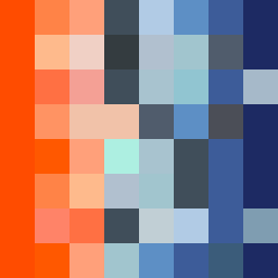
Square Project artwork
Center vs Edges
vulnerability vs strength; exposure_vs_shelter; rising_signal; outside_inward; flood against spark; hard_edges; thin_vs_heavy; tiny_plus; connection_alienation | abstract variation request 394; target batch count 500
- Grid
- 8 x 8
- Cells
- 64
- Colors
- 28
- Record
- 8bca4786
Artist Statement
This piece explores the emotional interplay between vulnerability and strength through the juxtaposition of warm and cool colors. The palette, inspired by shades from desire to emptiness, captures the tension between the dominant blood orange and coral against softer hollow blue and charcoal shades. The main contrast occurs in the center, where the warm colors suggest strength, while the cooler colors signal vulnerability and exposure in the edges. The falling pixel layout reflects a sense of descent and heaviness, inviting a feeling of reflection on the balance between protection and exposure in our experiences.