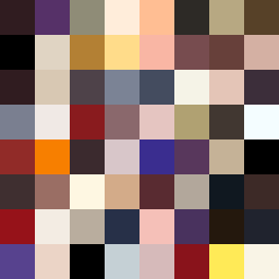
Square Project artwork
Resilience in Collision
vulnerability vs strength; exposure_vs_shelter; rising_signal; outside_inward; flood against spark; hard_edges; thin_vs_heavy; tiny_plus; connection_alienation | abstract variation request 260; target batch count 500
- Grid
- 8 x 8
- Cells
- 64
- Colors
- 61
- Record
- 8b7d400a
Artist Statement
The emotional tone reflects a tension between vulnerability and strength, embodied through contrasting color placements. The palette includes deep red oxide and muted cream to depict moments of both sheltering support and exposed fragility. The dominant blackened plum interrupts soft cream formations, creating a collision of emotional states. This reflects the seed's concepts of ‘exposure vs shelter’—the vulnerable center suggested through light and airy hues, surrounded by harsh edges of darker tones invoking strength. The layout of descending pixels illustrates a flow reminiscent of tears or rain, establishing a sense of descent and gravity, as well as a release of pressure punctured by radiant accents.