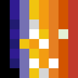
Square Project artwork
Interplay of Tension
fear vs hope; inside_vs_outside; rising_signal; zigzag; rain against broken_dots; corner_heavy; sharp_vs_soft; single_pixel; fear_hope | abstract variation request 103; target batch count 200
- Grid
- 8 x 8
- Cells
- 64
- Colors
- 12
- Record
- 8b5bdfa3
Artist Statement
The emotional tone contrasts between fear, represented by dark and jagged elements, and hope, represented by lighter, upward flows. The palette of black, dark violet, soft gold, and pale green allows for a stark contrast that creates tension within the square. The sharp vs. soft contrast manifests in jagged edges mixed with softer, brighter colors that suggest a central glow. The arrangement signifies a push-pull dynamic where darker colors crowd the edges, while lighter pops of color pierce through, representing rising hope amidst fear. The broken pixels introduce imperfection, reinforcing the feeling of chaos versus serenity. The overall layout and patterns are structured yet chaotic, emphasizing the emotional battle of 'inside vs outside' and 'fear vs hope'.