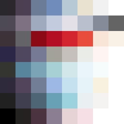
Square Project artwork
Pressure and Release
quiet vs pressure; symmetry_vs_break; diagonal_argument; counterflow; shatter against tide; hard_edges; sharp_vs_soft; island; clarity_confusion | abstract variation request 387; target batch count 500
- Grid
- 8 x 8
- Cells
- 64
- Colors
- 58
- Record
- 8b40a7c6
Artist Statement
The emotional tone of this piece reflects the tension between quietness and pressure. The palette features a mixture of muted tones like off-white and dust gray, combined with a bold compressed red and dark navy. This choice introduces a stark contrast, emphasizing the pressure against quieter spaces. The arrangement utilizes a stacked bands layout, with denser colors anchoring the left side symbolizing pressure, while the right gradually releases into softer hues of faint peach and off-white, representing quiet. The main collision occurs along the diagonal, where sharp edges meet softer transitions, echoing the title's theme of conflicting emotions. This use of color and form disrupts the space and creates a dynamic feeling, suggestive of shattering against a tide or the illusion of clarity in confusion.