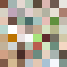
Square Project artwork
Exposure vs Shelter
safety vs exposure; pressure_vs_release; split_vertical; echo_right; braid against ripple; pressure_border; thin_vs_heavy; vessel; softness_severity | abstract variation request 138; target batch count 500
- Grid
- 8 x 8
- Cells
- 64
- Colors
- 64
- Record
- 89daa789
Artist Statement
This artwork explores the tension between safety and exposure through contrasting color placement. The palette consists of warm brown and shelter green to evoke feelings of security, while the pale skin and cold white introduce themes of vulnerability and exposure. The dominant warm hues create a protective enclosure around the cooler tones, reflecting the concept of a sheltered center versus an exposed space. The main collision occurs in the central column, which features a mix of warm and cool tones, emphasizing the dichotomy of emotions. The broken pixels disrupt the flow, simulating imperfections and echoing the emotional scars of exposure, while maintaining a consistent pattern that suggests an underlying rhythm of safety.