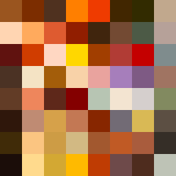
Square Project artwork
Contrast of Time
nostalgia vs progress; rise_vs_fall; split_horizontal; drip; target against grid; bottom_weighted; full_vs_hollow; window; rage_calm | abstract variation request 39; target batch count 200
- Grid
- 8 x 8
- Cells
- 64
- Colors
- 64
- Record
- 88ae7ec2
Artist Statement
The artwork explores the emotional tension between nostalgia and progress, presenting a split layout that embodies the contrasts of memory and forward motion. The palette of burnt orange, dark red, charcoal, and gold reflects both warmth and intensity—evoking feelings of longing and ambition. The left half, embodying nostalgia, is characterized by radial patterns that create a sense of containment and comfort. In contrast, the right half employs maze-like patterns to illustrate the complexities and uncertainties of progress. The edges are sharply defined, enhancing the tension between the two emotional states. The placement of color creates a collision, particularly where bold burnt orange meets the more muted charcoal, suggesting a struggle between the weight of the past and the drive toward the future. The incorporation of broken pixels introduces imperfections that speak to the inherent fragility of both emotions. This abstract composition serves as a visual metaphor for the continuous dialogue between remembering and advancing.