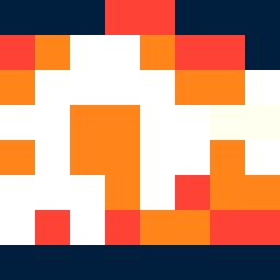
Square Project artwork
Conflict of Presence
vulnerability vs strength; exposure_vs_shelter; rising_signal; outside_inward; flood against spark; hard_edges; thin_vs_heavy; tiny_plus; connection_alienation | abstract variation request 8; target batch count 500
- Grid
- 8 x 8
- Cells
- 64
- Colors
- 5
- Record
- 888f6767
Artist Statement
The emotional tone integrates vulnerability and strength, represented by the contrasting use of softer colors in the center against deeper tones at the borders. The chosen palette consists of off-white and faint peach as quiet, gentle anchors, while dark navy and compressed red assert dominance and tension. The main collision occurs where the soft peach meets the stark navy, suggesting a clash between exposure and fortification. This layering evokes an abstract narrative of seeking shelter within chaos, aligning with the seed's themes.