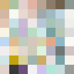
Square Project artwork
Exposure vs Shelter
safety vs exposure; pressure_vs_release; split_vertical; echo_right; braid against ripple; pressure_border; thin_vs_heavy; vessel; softness_severity | abstract variation request 367; target batch count 500
- Grid
- 8 x 8
- Cells
- 64
- Colors
- 64
- Record
- 885233a9
Artist Statement
This piece embodies the tension between exposure and safety, represented through vertical bands that suggest a split. The palette features warm brown and shelter green to evoke feelings of enclosure and protection, contrasting with pale skin and cold white that signify vulnerability. The main collision occurs centrally, where the softer colors ripple outward, interrupted by heavier shades that frame this open space, creating a dynamic interplay of protection and exposure. Broken pixels add an intentional disruption, hinting at the imperfections of these emotional states. The flow is horizontal, giving the sensation of waves shifting between safety and exposure, with a negative space that enhances the feeling of emotional outskirts. The resulting abstract artwork reads as a layered emotional strata, grappling with vulnerability and shelter.