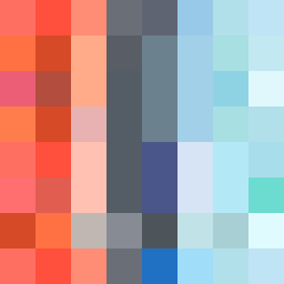
Square Project artwork
Resonance of Contrast
vulnerability vs strength; light_vs_weight; mirror_broken; sweep; constellation against tide; closed_corners; thin_vs_heavy; horizon; safety_exposure | abstract variation request 285; target batch count 500
- Grid
- 8 x 8
- Cells
- 64
- Colors
- 39
- Record
- 88390932
Artist Statement
This artwork embodies the emotional interplay between vulnerability and strength through its arrangement and color choices. The intense palette of hot coral and blood orange collide with the muted tones of charcoal and hollow blue, creating a tension that echoes the themes of exposure and protection. The pattern of crosshatch represents strength while the rain-like components suggest the fragility of vulnerability. The central area draws focus, swathed in powerful colors, while edges gently fade into quieter fields, signifying encroaching vulnerability. The structured collision at the center reveals the dynamic between protection and exposure.