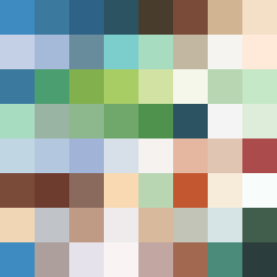
Square Project artwork
Exposure vs Shelter
safety vs exposure; pressure_vs_release; split_vertical; echo_right; braid against ripple; pressure_border; thin_vs_heavy; vessel; softness_severity | abstract variation request 104; target batch count 500
- Grid
- 8 x 8
- Cells
- 64
- Colors
- 58
- Record
- 866fa45d
Artist Statement
The emotional tone captures the tension between vulnerability and protection. The palette combines the warmth of sheltering greens and browns with the cool exposure of whites and blues, creating a visual rhythm that reflects pressure and release. The outer edges represent safety with a dense warmth, while the inner section introduces softer hues that represent exposure, allowing for gentle interaction. The collision occurs in the middle, where pulsing texture meets a guarded frame, illustrating the fight between these emotions.