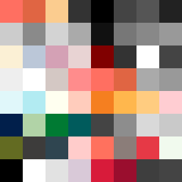
Square Project artwork
Tide of Contrast
vulnerability vs strength; light_vs_weight; mirror_broken; sweep; constellation against tide; closed_corners; thin_vs_heavy; horizon; safety_exposure | abstract variation request 426; target batch count 500
- Grid
- 8 x 8
- Cells
- 64
- Colors
- 53
- Record
- 85ca4fd0
Artist Statement
The emotional tone captures the tension between vulnerability and strength, represented through the juxtaposition of soft, pale colors against vivid, dense ones. The selected palette of hot coral, blood orange, dust pink, charcoal, and hollow blue creates a warm-cool emotional tension, with muted pastels signaling vulnerability and vibrant tones suggesting strength. The collision of static and dots patterns reflects an interplay between fragility and resilience, primarily anchored at the center while gradually shifting towards edges that feel more vulnerable. This dynamic creates a visual rhythm that resonates with the theme of exposure juxtaposed against safety, drawing on the seed's essence of brokenness and contrast.