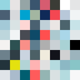
Square Project artwork
Exposure vs Shelter
vulnerability vs strength; light_vs_weight; mirror_broken; sweep; constellation against tide; closed_corners; thin_vs_heavy; horizon; safety_exposure | abstract variation request 113; target batch count 500
- Grid
- 8 x 8
- Cells
- 64
- Colors
- 63
- Record
- 850524ee
Artist Statement
This piece embodies the emotional tension between vulnerability and strength. The palette balances pale aqua and mist gray, signifying vulnerability, against deeper ink blue and alarm red which represent strength. The inner 4x4 section, framed by the stronger colors, creates a dynamic flow that echoes rightward, emphasizing the contrast. The broken dots pattern disrupts the calm of the frame, showcasing moments of fragility amidst strength. The potential negativity of space reflects the need for safety while exposing the raw core as a reminder of risks taken, creating a narrative of precarious balance.