Square Project artwork
Exposure and Shelter
vulnerability vs strength; exposure_vs_shelter; rising_signal; outside_inward; flood against spark; hard_edges; thin_vs_heavy; tiny_plus; connection_alienation | abstract variation request 163; target batch count 500
- Grid
- 8 x 8
- Cells
- 64
- Colors
- 14
- Record
- 84bef7be
Artist Statement
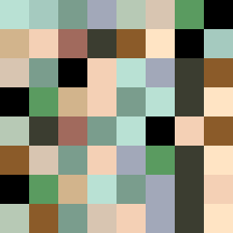
This piece embodies the emotional dichotomy of vulnerability against strength through its color patterns and spatial arrangement. A central pale space (#F4D0B5) represents vulnerability amid a protective framework of deeper hues. The use of shelter green (#5A9B60) and soft brown (#8B5B29) juxtaposes the feelings of grounding and safety against exposed elements. The edges are defined yet irregular, marking the contrast between hard edges and soft breaks, while broken pixels introduce intentional imperfections. The main collision occurs diagonally, where the pale center interacts with more saturated colors, echoing the tension between exposure and sanctuary.