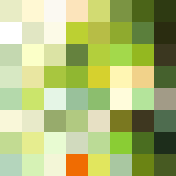
Square Project artwork
Exposure vs Shelter
restlessness vs peace; memory_vs_motion; diagonal_argument; edge_crawl; flame against shatter; closed_corners; light_vs_dark; patch; signal_noise | abstract variation request 104; target batch count 500
- Grid
- 8 x 8
- Cells
- 64
- Colors
- 64
- Record
- 8261a922
Artist Statement
This composition embodies the emotional tension between restlessness and peace through a structured yet dynamic arrangement. The palette of ripe green, acid green, and honey gold signifies vitality and calmness, while deep olive and cream offer contrasting softness, evoking a feeling of balance amidst chaos. The main collision occurs diagonally across the canvas, where vibrant colors clash with quiet backgrounds, representing a memory versus motion narrative. The design respects the quiet channel layout, leaving sufficient negative space that amplifies the sense of potential disruption.