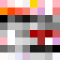
Square Project artwork
Tension of Exposed Spaces
vulnerability vs strength; exposure_vs_shelter; rising_signal; outside_inward; flood against spark; hard_edges; thin_vs_heavy; tiny_plus; connection_alienation | abstract variation request 332; target batch count 500
- Grid
- 8 x 8
- Cells
- 64
- Colors
- 44
- Record
- 8229c3f1
Artist Statement
The emotional tone reflects a deep interplay between vulnerability and strength, showcased through a mix of soft pastels and stark, dense colors. The palette, combining powder pink and sharp crimson with bold blacks and grays, sets the stage for tension. The main collision occurs in the lower half, where the dark colors dominate, symbolizing strength struggling against a light, exposed center suggesting vulnerability. This asymmetry allows for a narrative of protection versus exposure, enhancing the abstract quality as colors clash subtly yet powerfully.