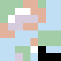
Square Project artwork
Exposure vs Shelter
safety vs exposure; pressure_vs_release; split_vertical; echo_right; braid against ripple; pressure_border; thin_vs_heavy; vessel; softness_severity | abstract variation request 142; target batch count 500
- Grid
- 8 x 8
- Cells
- 64
- Colors
- 6
- Record
- 81db9528
Artist Statement
The emotional tone juxtaposes vulnerability against protection. The palette blends shelter green and warm brown, symbolizing safety, with accents of pale skin and cold white, evoking exposure. The main contrast occurs around the center, creating a tension between the soft barrier and bright vulnerability. The vertical split aligns with the seed's theme of division, allowing colors to collide asymmetrically while maintaining a whisper of negative space—echoes of softness and severity intertwined in the composition's core.