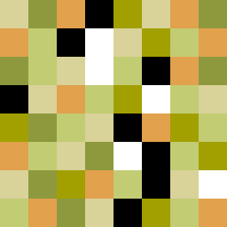
Square Project artwork
Exposure vs Shelter
vulnerability vs strength; symmetry_vs_break; cross_current; braid; flood against stack; pressure_border; fast_vs_slow; tiny_face; desire_emptiness | abstract variation request 322; target batch count 500
- Grid
- 8 x 8
- Cells
- 64
- Colors
- 7
- Record
- 81423f85
Artist Statement
This abstract piece explores the tension between vulnerability and strength through a contrasting color palette and layout. The selected colors of ripe green, honey gold, and deep olive provide depth and warmth, while pale cream emphasizes fragility. The pattern of dots indicates vulnerability, intermingling with strong halos that signify resilience. The central collision between the two emotional states creates a rhythmic push-pull, symbolizing the delicate balance between exposure and protection.