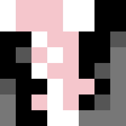
Square Project artwork
Exposure vs Shelter
vulnerability vs strength; symmetry_vs_break; cross_current; braid; flood against stack; pressure_border; fast_vs_slow; tiny_face; desire_emptiness | abstract variation request 3; target batch count 500
- Grid
- 8 x 8
- Cells
- 64
- Colors
- 5
- Record
- 7dcda25e
Artist Statement
The emotional tone reflects the tension between vulnerability and strength, where soft colors like powder pink and warm white symbolize exposure, while stark hues of carbon black and sharp crimson embody strength. The palette creates a duality that suggests a struggle, featuring a serene center interrupted by bold edges, aligning with the layout of eroded symmetry. The main collision occurs at the center where the contrasting patterns of ladder (vulnerability) and split-screen (strength) interact, suggesting an unresolved conflict and the push-pull of safety versus exposure.