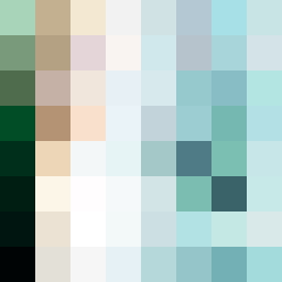
Square Project artwork
Exposure and Shelter
safety vs exposure; pressure_vs_release; split_vertical; echo_right; braid against ripple; pressure_border; thin_vs_heavy; vessel; softness_severity | abstract variation request 349; target batch count 500
- Grid
- 8 x 8
- Cells
- 64
- Colors
- 64
- Record
- 7ab54a38
Artist Statement
This piece explores the emotional tension between safety and exposure. The use of a soft, muted palette of 'shelter green', 'warm brown', and 'pale skin' juxtaposed with 'cold white' and 'open blue' illustrates the duality of these feelings. The predominant color is a calming shelter green that embodies protection, while sporadic bursts of warmer tones represent exposure and emotional risk. Main collisions occur at the center and along the right edge, where dappled dot patterns of exposure sharply contrast against the gentle ash field texture of safety, inviting thought on balance and vulnerability in our experiences. The broken pixel placements create intentional imperfections, symbolizing how our protective layers are often not absolute, allowing glimpses into deeper, unguarded spaces.