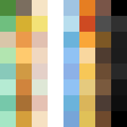
Square Project artwork
Exposure vs Shelter
safety vs exposure; pressure_vs_release; split_vertical; echo_right; braid against ripple; pressure_border; thin_vs_heavy; vessel; softness_severity | abstract variation request 51; target batch count 500
- Grid
- 8 x 8
- Cells
- 64
- Colors
- 54
- Record
- 79711fce
Artist Statement
The emotional tone embodies a tension between 'safety' and 'exposure'. The warm browns and soft greens symbolize safety and shelter, while cool whites and open blues reflect exposure and vulnerability. The center contains a pale skin tone, acting as a vulnerable focal point that can either be sheltered by warm colors or overwhelmed by cooler tones on the right. This pattern suggests a conversation between softness and severity, indicated by the rising flow from bottom to top, stirring feelings of hope amidst pressure. The layout emphasizes vertical movement while broken pixels introduce an element of disruption, capturing the fragility of safety against the relentless nature of exposure.