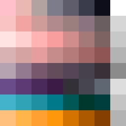
Square Project artwork
Exposure vs Shelter
softness vs severity; signal_vs_noise; open_gate; spiral_counterclockwise; pulse_marks against radial; bottom_weighted; light_vs_dark; tiny_plus; guilt_forgiveness | abstract variation request 389; target batch count 500
- Grid
- 8 x 8
- Cells
- 64
- Colors
- 63
- Record
- 78c60146
Artist Statement
The emotional tone of this artwork reflects the tension between softness and severity, showcased through the palette of 'powder pink', 'warm white', 'carbon black', 'steel gray', and 'sharp crimson'. The gradient from soft hues to darker, more severe tones illustrates the push-pull between exposure and shelter in the composition. The main collision occurs near the center, where warm and cool tones interact, echoing the themes of light versus dark and vulnerability against rigidity. The broken pixels introduce intentional imperfections, enhancing the sense of an open gate inviting uncertainty while maintaining a defined boundary with jagged edges. This pattern embodies the complexities of guilt and forgiveness, embodying the emotional layering created by each color’s placement and intensity.