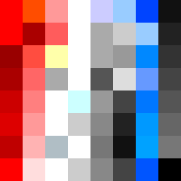
Square Project artwork
Exposure vs Shelter
tenderness vs rage; inside_vs_outside; quiet_channel; climb; constellation against rain; pixel_bleed; saturated_vs_muted; crown; guilt_forgiveness | abstract variation request 247; target batch count 500
- Grid
- 8 x 8
- Cells
- 64
- Colors
- 40
- Record
- 783971e2
Artist Statement
This composition navigates the emotional spectrum between tenderness and rage through a strategic color palette of red, black, pale blue, and white that suggests both intensity and calmness. The dark colors anchor the viewer in the rage, while pale blues and whites create zones of tenderness, emphasizing vulnerability. The layout starts from the corner (rage), with color density spilling diagonally across the canvas, creating a collision in the central area, where tender colors subtly interrupt the stronger hues. The 'wave' shape seed is abstractly represented through fluid patterns that evoke shifts between pressure and quietness, balancing broken pixels as scars of emotional authenticity.