Square Project artwork
Exposure vs Shelter
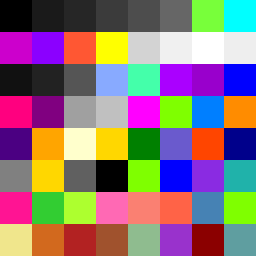
vulnerability vs strength; light_vs_weight; mirror_broken; sweep; constellation against tide; closed_corners; thin_vs_heavy; horizon; safety_exposure | abstract variation request 202; target batch count 500
- Grid
- 8 x 8
- Cells
- 64
- Colors
- 59
- Record
- 78208502
Artist Statement
This piece embodies the emotional interplay between vulnerability and strength through an asymmetrical arrangement. The color palette merges colder tones of black and electric blue, creating a stark contrast against warmer magenta and lime green. The dense cluster of colors in the top left corner signifies pressure and strength, cascading outward towards the softer, lighter tones, representing vulnerability and exposure. The broken pixels introduce intentional disruption, suggesting the effects of life's pressures while maintaining a sense of flow from the corner into the exposed center, guiding the viewer's emotional journey through shades of safety and exposure.