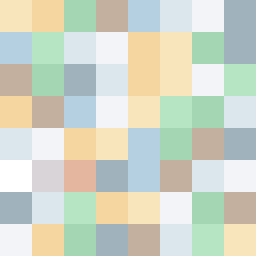
Square Project artwork
Exposure vs Shelter
safety vs exposure; pressure_vs_release; split_vertical; echo_right; braid against ripple; pressure_border; thin_vs_heavy; vessel; softness_severity | abstract variation request 64; target batch count 500
- Grid
- 8 x 8
- Cells
- 64
- Colors
- 12
- Record
- 78053a12
Artist Statement
The emotional tone reflects a balance between vulnerability and protection. The palette embodies warmth with shelter green and warm brown contrasting against the pale skin and cold white, representing exposure. The checker pattern on one side embodies the exposure, while the flood pattern provides a sense of safety on the other. The main collision of color occurs in the center of the square, creating a tense intersection of feelings, optimal for the split vertical theme. The intentional broken pixels introduce disruption, symbolizing the fragility within the contrast.