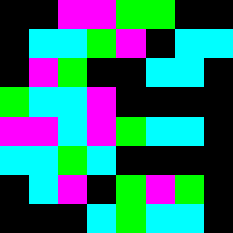
Square Project artwork
Exposure vs Shelter
vulnerability vs strength; light_vs_weight; mirror_broken; sweep; constellation against tide; closed_corners; thin_vs_heavy; horizon; safety_exposure | abstract variation request 359; target batch count 500
- Grid
- 8 x 8
- Cells
- 64
- Colors
- 4
- Record
- 77942c2c
Artist Statement
This artwork captures the emotional tension between vulnerability and strength through a delicate arrangement of colors. The chosen palette of lime, black, electric blue, and magenta creates stark contrasts that highlight the feelings of safety and exposure. The dense black forms in one corner embody strength, while the lighter colors spread outward, signifying vulnerability as they collide and intertwine. The pattern suggests broken constellations, implying moments of exposure amidst the heaviness. The use of broken pixels adds intentional disruptions that evoke the idea of scars and healing, further illustrating the theme of emotional interplay.