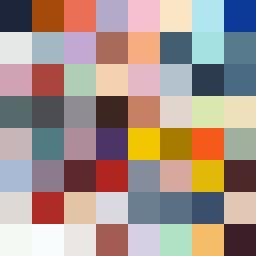
Square Project artwork
Exposure vs Shelter
vulnerability vs strength; symmetry_vs_break; cross_current; braid; flood against stack; pressure_border; fast_vs_slow; tiny_face; desire_emptiness | abstract variation request 389; target batch count 500
- Grid
- 8 x 8
- Cells
- 64
- Colors
- 64
- Record
- 76c7f3e4
Artist Statement
The emotional tone navigates between vulnerability and strength, creating a dynamic interplay of texture and contrast. The color palette of warm coral and cold slate contrasts soft amber against a foundation of blue-black, symbolizing tension and relief. The small central form, representing vulnerability, is enveloped by stronger radial patterns of strength. This juxtaposition delivers an overall sense of exposure shielded by boundary, while the intentional placement of broken pixels introduces imperfection, enhancing the theme of vulnerability against strength's assertiveness. The main contrast occurs in the central third of the square, where the light colors meet darker tones, creating an interrupted flow and visual collision that resonates with the seed's narrative.