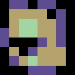
Square Project artwork
Exposure vs Shelter
vulnerability vs strength; symmetry_vs_break; cross_current; braid; flood against stack; pressure_border; fast_vs_slow; tiny_face; desire_emptiness | abstract variation request 18; target batch count 500
- Grid
- 8 x 8
- Cells
- 64
- Colors
- 4
- Record
- 75caedd4
Artist Statement
The emotional tone reflects the tension between vulnerability and strength, with a delicate interplay of pale and dense colors. The choice of dark violet and soft gold embodies protection and warmth, while the pale green introduces a sense of exposure. The conflict centers at the grid's midsection, where these colors collide, representing both a shield against and a surrender to pressure. The incomplete double outline enhances a fragile boundary, suggesting an evolving state of safety and risk.