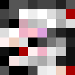
Square Project artwork
Exposure vs Shelter
vulnerability vs strength; light_vs_weight; mirror_broken; sweep; constellation against tide; closed_corners; thin_vs_heavy; horizon; safety_exposure | abstract variation request 420; target batch count 500
- Grid
- 8 x 8
- Cells
- 64
- Colors
- 25
- Record
- 739a388a
Artist Statement
This artwork captures the juxtaposition of vulnerability and strength through a delicate balance of colors. The palette of soft pinks and whites represents vulnerability and exposure, while deep blacks and steel grays signify strength and density. The dominant black and gray tones create an imposing presence, while the lighter hues form a fragile core that seems to be under pressure. The main collision occurs in the center with the bright pink and white cluster, symbolizing sudden exposure amidst a protective shell. The edge style is open, allowing moments of 'light' to escape, creating a rhythm that reflects themes of exposure against safety.