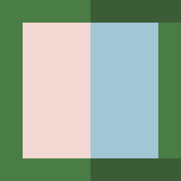
Square Project artwork
Exposure vs Shelter
safety vs exposure; pressure_vs_release; split_vertical; echo_right; braid against ripple; pressure_border; thin_vs_heavy; vessel; softness_severity | abstract variation request 126; target batch count 500
- Grid
- 8 x 8
- Cells
- 64
- Colors
- 4
- Record
- 73974e4b
Artist Statement
This piece embodies the tension between safety and exposure through a structured composition. The outer palette leans toward soft, muted tones like shelter_green and warm_brown, representing the comforting enclosure of safety. In contrast, the inner layer uses brighter hues such as open_blue and pale_skin, symbolizing vulnerability and exposure. The central horizontal band suggests pressure, with a rhythmic pulse pattern invoking the heartbeat of existence. Broken pixel elements disrupt the symmetry, representing imperfection and the unpredictable nature of emotions. The overall flow moves outward from the center, highlighting the tension between softness and severity as the colors collide, creating an echoing resonance of protection and exposure.