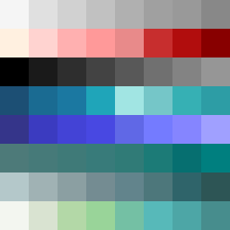
Square Project artwork
Pressure vs Release
quiet vs pressure; symmetry_vs_break; diagonal_argument; counterflow; shatter against tide; hard_edges; sharp_vs_soft; island; clarity_confusion | abstract variation request 26; target batch count 500
- Grid
- 8 x 8
- Cells
- 64
- Colors
- 64
- Record
- 72052749
Artist Statement
This artwork explores the emotional contrast between quietness and pressure through color arrangement and density. The palette shifts from soft, warm hues (off_white and faint_peach) symbolizing calmness, to darker, cooler tones (dark_navy) representing pressure. The arrangement features a checker pattern for pressure and a ring pattern for quiet, creating a tension-filled yet airy space in the center that gradually releases towards the borders. The deliberate breaks in the border evoke imperfection, allowing the quieter colors to seep through, suggesting both confinement and escape. The collision occurs around the center, where the most vibrant colors are tightly packed, contrasting with the expansive negative space that represents tranquility.