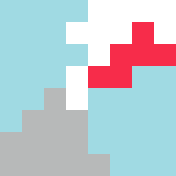
Square Project artwork
Exposure vs Shelter
vulnerability vs strength; light_vs_weight; mirror_broken; sweep; constellation against tide; closed_corners; thin_vs_heavy; horizon; safety_exposure | abstract variation request 246; target batch count 500
- Grid
- 8 x 8
- Cells
- 64
- Colors
- 4
- Record
- 71903409
Artist Statement
This piece expresses the tension between vulnerability and strength. The soft tones of pale aqua and mist gray create an exposed center, suggesting fragility, while the deeper ink blue and alarm red provide a contrasting foundation that suggests strength. The lattice pattern intermingles with broken dots to depict the collision of safety and exposure. The frame of louder colors around the edges gives structure to the pale, unguarded center, evoking feelings of security that are protective yet porous.