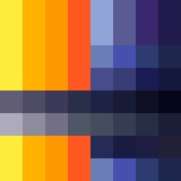
Square Project artwork
Rise vs Fall
joy vs grief; order_vs_chaos; center_seed; bottom_to_top; split_screen against rain; hard_edges; safe_vs_threatened; stair_step; machine_emotion | abstract variation request 44; target batch count 200
- Grid
- 8 x 8
- Cells
- 64
- Colors
- 36
- Record
- 6fdd04d1
Artist Statement
The emotional tone emphasizes the duality of joy and grief, represented by vibrant yellows and oranges vs muted blues and purples. The palette reflects joy with bright, rounded tones rising at the bottom-left, while the darker, fragmented tones encapsulate grief, creating a split emotional screen. The contrast between the warm and cool tones represents the collision between hope and sorrow. The hard edges and checker/mirror patterns respectively highlight the structured nature of joy against the disordered feel of grief, guiding the viewer's experience through each pixel's emotional weight.