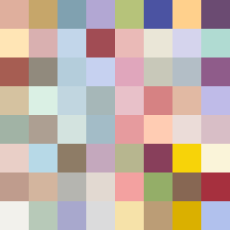
Square Project artwork
Tension of Opposites
vulnerability vs strength; light_vs_weight; mirror_broken; sweep; constellation against tide; closed_corners; thin_vs_heavy; horizon; safety_exposure | abstract variation request 65; target batch count 500
- Grid
- 8 x 8
- Cells
- 64
- Colors
- 64
- Record
- 6dd7c400
Artist Statement
This artwork embodies the emotional tension between vulnerability and strength through a carefully chosen palette and color placement. The colors represent the concept of intimacy and distance, with warm shadows and cool blues evoking the oscillation between safety and exposure. The main contrast occurs centrally where the stronger tones and deeper hues converge, suggesting conflict and resolution amid the delicate edges. Broken pixels serve as intentional disruptions, echoing the theme of fragility in strength, while the layout promotes a sense of pulsing energy between the centers, amplifying the feeling of conflict and balance.