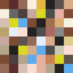
Square Project artwork
Exposure and Shelter
vulnerability vs strength; exposure_vs_shelter; rising_signal; outside_inward; flood against spark; hard_edges; thin_vs_heavy; tiny_plus; connection_alienation | abstract variation request 198; target batch count 500
- Grid
- 8 x 8
- Cells
- 64
- Colors
- 29
- Record
- 6d74d2d6
Artist Statement
The emotional tone reflects the tension between vulnerability and strength. A muted palette of reds and grays suggests both warmth and restraint, with blackened plum representing the depth of vulnerability. The placement of colors forms a dynamic collision at the center where strength (represented by stronger, clearer colors) meets the squish of vulnerability (the softer hues). The layout of falling pixels symbolizes the gentle descent of both emotional contrasts—a gradual exposure against a protective barrier. Broken pixels create intentional interruptions, enhancing the feeling of imperfection and tension within the frame, while the overall balance leaves a 10% negative space for breath and reflection.