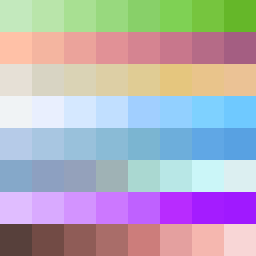
Square Project artwork
Exposure vs Shelter
safety vs exposure; pressure_vs_release; split_vertical; echo_right; braid against ripple; pressure_border; thin_vs_heavy; vessel; softness_severity | abstract variation request 437; target batch count 500
- Grid
- 8 x 8
- Cells
- 64
- Colors
- 64
- Record
- 6b83d1c5
Artist Statement
The emotional tone captures a conflict between safety and vulnerability. The palette reflects 'shelter green' and 'cold white' for safety, and 'open blue' for exposure, creating a tension in color. The top rows evoke a protective feeling with muted, calming shades, while the bottom rows explode with vibrant indigo and pale skin tones, representing exposure. Contrast is emphasized by collision in the center, where safety softens the edges and the exposure radiates outward, creating echoes of color that interlace and disrupt. The positive and negative space rhythmically interplays to convey a story of juxtaposition.