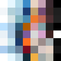
Square Project artwork
Exposure vs Shelter
vulnerability vs strength; light_vs_weight; mirror_broken; sweep; constellation against tide; closed_corners; thin_vs_heavy; horizon; safety_exposure | abstract variation request 148; target batch count 500
- Grid
- 8 x 8
- Cells
- 64
- Colors
- 57
- Record
- 6af0c659
Artist Statement
The artwork contrasts vulnerability with strength through layers of color that suggest protection and exposure. The palette of clean white and ice blue evoke lightness and safety, while the darker hues of ink black and violet gray add depth and weight. The broken pixels introduce a sense of imperfection, emphasizing vulnerability. The main collision occurs in the center, where lighter threads intertwine with heavier sparks, creating a dynamic interplay between the two emotional states that is reflective of the seed's theme.