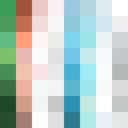
Square Project artwork
Exposure vs Shelter
safety vs exposure; pressure_vs_release; split_vertical; echo_right; braid against ripple; pressure_border; thin_vs_heavy; vessel; softness_severity | abstract variation request 413; target batch count 500
- Grid
- 8 x 8
- Cells
- 64
- Colors
- 63
- Record
- 6ad31451
Artist Statement
This abstract composition explores the tension between safety and exposure through a vertically split layout, reflecting on emotional contrasts. The left section embodies safety with a soothing palette of shelter green and warm brown, evoking a gentle weight and stability. The right section, in cold white and open blue, represents exposure, filled with bright vulnerability and uncaptured edges. The center remains an intersection of these feelings, where colors collide and intertwine, capturing the essence of pressure and release, and the emotional flow from calm to intensity. Broken pixels are implemented to create intentional disturbances, emphasizing the imperfections that come with both safety and exposure.