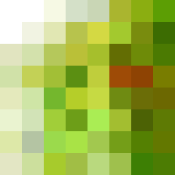
Square Project artwork
Exposure vs Shelter
vulnerability vs strength; light_vs_weight; mirror_broken; sweep; constellation against tide; closed_corners; thin_vs_heavy; horizon; safety_exposure | abstract variation request 138; target batch count 500
- Grid
- 8 x 8
- Cells
- 64
- Colors
- 62
- Record
- 680e2d48
Artist Statement
The emotional tone reflects the tension between vulnerability and strength, articulated through soft, muted colors against a rich, deep green foreground. The palette combines 'ripe green' and 'acid green' to represent growth and tension, while the 'cream' introduces a quiet softness amidst stronger hues, embodying safety within exposure. The main collision occurs in the center, where pulse marks of vulnerability clash with thick channels of strength, laid out with receding edges to suggest a flow of safety receding from impending threats. The absence of structure in the outer rows allows the central 3x3 area to resonate as the focal point against a backdrop of negative space.