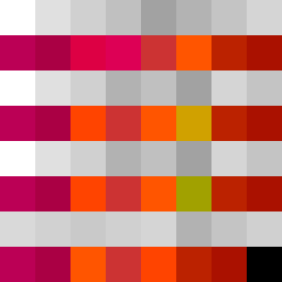
Square Project artwork
Pressure vs Release
quiet vs pressure; symmetry_vs_break; diagonal_argument; counterflow; shatter against tide; hard_edges; sharp_vs_soft; island; clarity_confusion | abstract variation request 177; target batch count 500
- Grid
- 8 x 8
- Cells
- 64
- Colors
- 24
- Record
- 6741bb87
Artist Statement
The emotional tone juxtaposes the tightness of 'pressure' with the expansiveness of 'quiet'. The chosen palette, featuring muted colors like off-white and dust gray, supports the soft horizon of calm while accenting with compressed red and dark navy to suggest areas of tension and force. A horizontal split layout emphasizes the presence of density in the top rows against softer, more negative space in the bottom. The collision occurs at the center, where sharp edges of pressure (dark hues) contend with gentle flows (pale colors), echoing the tension of the seed's themes: counterflow and contradiction. The broken pixels are scattered to emphasize shattering against the tide, introducing intentional imperfection that complements both aesthetic and emotional narrative.