Square Project artwork
Pressure vs Release
quiet vs pressure; symmetry_vs_break; diagonal_argument; counterflow; shatter against tide; hard_edges; sharp_vs_soft; island; clarity_confusion | abstract variation request 468; target batch count 500
- Grid
- 8 x 8
- Cells
- 64
- Colors
- 61
- Record
- 6685c775
Artist Statement
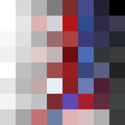
The emotional tone balances between the tension of pressure and the softness of quietness. The palette combines muted hues like off-white and dust gray to depict quietness, contrasted by the deeper tones of compressed red and dark navy, symbolizing pressure. The layout represents a rising signal with dense colors at the bottom gradually loosening into lighter shades, creating a sense of upward motion. The main collision occurs diagonally across the square, where bold accents clash with softer fields, echoing the themes of clarity vs. confusion and a break against symmetry.