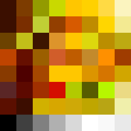
Square Project artwork
Exposure vs. Shelter
vulnerability vs strength; symmetry_vs_break; cross_current; braid; flood against stack; pressure_border; fast_vs_slow; tiny_face; desire_emptiness | abstract variation request 114; target batch count 500
- Grid
- 8 x 8
- Cells
- 64
- Colors
- 61
- Record
- 64a90610
Artist Statement
This artwork embodies the emotional tension between vulnerability and strength, expressed through a stark contrast of colors and patterns. The selected palette of burnt orange, dark red, charcoal, and gold suggests warmth and resilience but also discomfort and exposure. The central area features the soft, wave-like 'tide' pattern representing vulnerability, while the rigid 'patchwork' pattern of darker tones surrounding it symbolizes strength. The primary collision occurs at the center, where soft curves meet jagged edges, creating a tension that represents the struggle between feeling sheltered and exposed under pressure. This arrangement encourages viewers to contemplate their own experiences of vulnerability balanced against resilience.