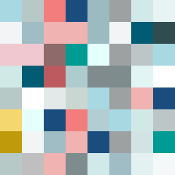
Square Project artwork
Exposure vs Shelter
restlessness vs peace; memory_vs_motion; diagonal_argument; edge_crawl; flame against shatter; closed_corners; light_vs_dark; patch; signal_noise | abstract variation request 184; target batch count 500
- Grid
- 8 x 8
- Cells
- 64
- Colors
- 34
- Record
- 642bb837
Artist Statement
The emotional tone captures the dichotomy of restlessness and peace, with a palette that reflects serenity (pale aqua, mist gray) and urgency (alarm red, ink blue). The main contrast occurs in the center, where a pale field (pale aqua) attempts to resist the encroaching pressures of darker accents and restless patterns (alarm red and ink blue). The chosen flow and patterns create a visual conflict, with ripples of tranquility interrupted by the chaotic veil of restlessness, suggesting tension and unresolved emotion.