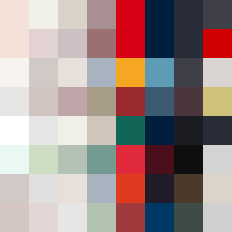
Square Project artwork
Pressure and Release
quiet vs pressure; symmetry_vs_break; diagonal_argument; counterflow; shatter against tide; hard_edges; sharp_vs_soft; island; clarity_confusion | abstract variation request 338; target batch count 500
- Grid
- 8 x 8
- Cells
- 64
- Colors
- 52
- Record
- 63e619fa
Artist Statement
The artwork explores the emotional tension of 'quiet vs pressure' through a juxtaposition of soft and sharp colors. Lighter hues like faint peach and off-white represent calmness and clarity, spread across the grid, while darker shades like compressed red and dark navy convey the feeling of weight and crowding. The collision of these colors predominantly occurs along the central diagonal, creating tension that speaks to the themes of symmetry and break, echoing the idea of an island amidst a turbulent sea. The negative space supports quietness, while broken pixels introduce imperfection and disruption, enhancing the abstract story of pressure releasing into stillness.