Square Project artwork
Exposure vs Shelter
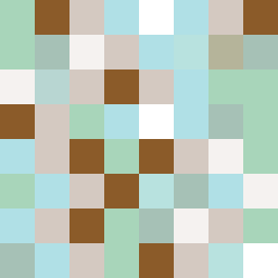
safety vs exposure; pressure_vs_release; split_vertical; echo_right; braid against ripple; pressure_border; thin_vs_heavy; vessel; softness_severity | abstract variation request 13; target batch count 500
- Grid
- 8 x 8
- Cells
- 64
- Colors
- 10
- Record
- 62cb090c
Artist Statement
This composition uses contrasting colors to express the emotional tension between exposure and safety. The palette blends soft greens and warm browns to symbolize protection while introducing cool whites and blues that evoke a sense of openness. The main collision occurs in the center, where light hues clash with darker borders, reinforcing the idea of pressure within the frame of safety. The vertical split creates a dynamic rhythm that captures the balance between vulnerability and comfort, manifesting through irregular patterns that echo tension and release.