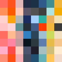
Square Project artwork
Exposure vs Shelter
vulnerability vs strength; exposure_vs_shelter; rising_signal; outside_inward; flood against spark; hard_edges; thin_vs_heavy; tiny_plus; connection_alienation | abstract variation request 164; target batch count 500
- Grid
- 8 x 8
- Cells
- 64
- Colors
- 64
- Record
- 61cf090f
Artist Statement
The emotional tone balances vulnerability and strength, creating a tension that resonates through the color palette of hot coral, blood orange, dust pink, charcoal, and hollow blue. The collision occurs in the center, where warm colors interrupt the cool, echoing the struggle between exposure and protection. Broken pixels provide intentional disruptions, representing scars and the acts of shielding or revealing. This piece encapsulates the abstract pattern of resistance and fragility.