Square Project artwork
Pressure vs Release
quiet vs pressure; symmetry_vs_break; diagonal_argument; counterflow; shatter against tide; hard_edges; sharp_vs_soft; island; clarity_confusion | abstract variation request 419; target batch count 500
- Grid
- 8 x 8
- Cells
- 64
- Colors
- 59
- Record
- 613291b8
Artist Statement
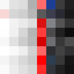
This artwork captures the tension of 'quiet' against 'pressure' through a careful arrangement of colors. The palette features soft hues of off-white and faint peach to embody quietness, juxtaposed with the weight of compressed red and dark navy to suggest pressure. The collision occurs predominantly at the center, where the dark colors converge, creating a heavy focal point that disturbs the surrounding lighter colors. The layout mimics a mirror yet breaks this symmetry with 2 bold, disrupted pixels that amplify the conflict between quietness and pressure, evoking feelings of tension and release. The 'island' conceptual seed manifests here as isolated patches of calm amid dense flows, aligning with a broader emotional narrative of clarity versus confusion.