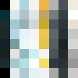
Square Project artwork
Intersecting Waves
vulnerability vs strength; exposure_vs_shelter; rising_signal; outside_inward; flood against spark; hard_edges; thin_vs_heavy; tiny_plus; connection_alienation | abstract variation request 187; target batch count 500
- Grid
- 8 x 8
- Cells
- 64
- Colors
- 60
- Record
- 6092a1ee
Artist Statement
The emotional tone reflects a delicate dance between vulnerability and strength, represented through contrasting colors that form a wave-like flow across the grid. The selected palette of pale mint, soft sky, storm gray, near black, and faded gold evokes both a sense of calm and pressure. The main collision occurs between dark and light tones at the center, where heavy colors meet softer shades, mimicking the chip away of hard edges by cracks — a visual representation of the tension between exposure and shelter. This pattern intertwines strength with vulnerability, suggesting growth through disruption.