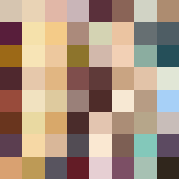
Square Project artwork
Exposure vs. Shelter
vulnerability vs strength; symmetry_vs_break; cross_current; braid; flood against stack; pressure_border; fast_vs_slow; tiny_face; desire_emptiness | abstract variation request 437; target batch count 500
- Grid
- 8 x 8
- Cells
- 64
- Colors
- 64
- Record
- 600f5dda
Artist Statement
This artwork captures the emotional contrast between vulnerability and strength through the arrangement of pale and dark tones. The chosen palette of guilt and forgiveness colors evokes a sense of depth and tension, with deep wine and soft gold acting as the accents that symbolize resilience amidst vulnerability. The rising signal layout suggests upward hope, with warm ivory and ash gray representing the exposed core, against clear blocks of stain brown. Broken pixels within the grid introduce intentional imperfection, highlighting the tension between safety and exposure, creating a visual collision primarily concentrated at the center. The artwork embodies the struggle between sheltering strength and the risks of openness.