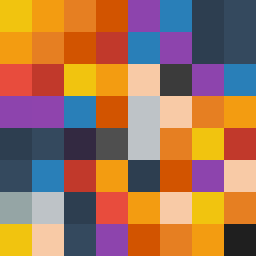
Square Project artwork
Wounded Strength
vulnerability vs strength; exposure_vs_shelter; rising_signal; outside_inward; flood against spark; hard_edges; thin_vs_heavy; tiny_plus; connection_alienation | abstract variation request 12; target batch count 500
- Grid
- 8 x 8
- Cells
- 64
- Colors
- 18
- Record
- 5ffd379f
Artist Statement
The emotional tone contrasts vulnerability with strength, using a palette of yellow, orange, deep blue, and muted purple to express warmth and depth. The boldness of yellows and oranges signifies strength while the greyish blue and purple hints at vulnerability. The collision happens diagonally, where the checker pattern of vulnerability meets the stacked strength pattern, creating a dynamic tension in the composition. The layered effects of edge interruptions and broken pixels symbolize scars, highlighting the fragility within strength, and reinforce the concept of exposure and shelter, aligning with the seed's themes.