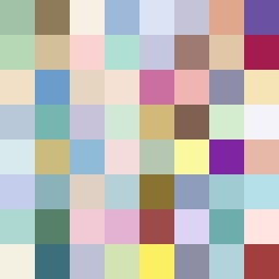
Square Project artwork
Exposure vs Shelter
safety vs exposure; pressure_vs_release; split_vertical; echo_right; braid against ripple; pressure_border; thin_vs_heavy; vessel; softness_severity | abstract variation request 1; target batch count 500
- Grid
- 8 x 8
- Cells
- 64
- Colors
- 64
- Record
- 5e52eaae
Artist Statement
This artwork explores the emotional tension between safety and exposure, using a palette that hints at protective and vulnerable qualities. The warm brown represents safety, while the cool open blue signifies exposure. The main contrast occurs in the center with a dense arrangement of dots (exposure) colliding against a flooded field of gentle safety colors at the edges. The placement of broken pixels introduces intentional imperfection, disrupting the flow and echoing life's unpredictability. This combination creates a dynamic visual narrative of tension and release, ultimately aiming for a balance yet leaving room for exploration.